

Theme & Appearance
Theme & Appearance is the storefront’s colour DNA. It’s distinct from
Style (shape) and
Structure (layout). Open it at Theme & Appearance in
the sidebar (/admin/settings).
There are two tabs at the top: Apply a Theme Preset (pick a ready-made theme) and Custom Theme (build your own from your brand colours). The current live theme is shown as “Currently active: …”.
Quick start — apply a ready-made theme
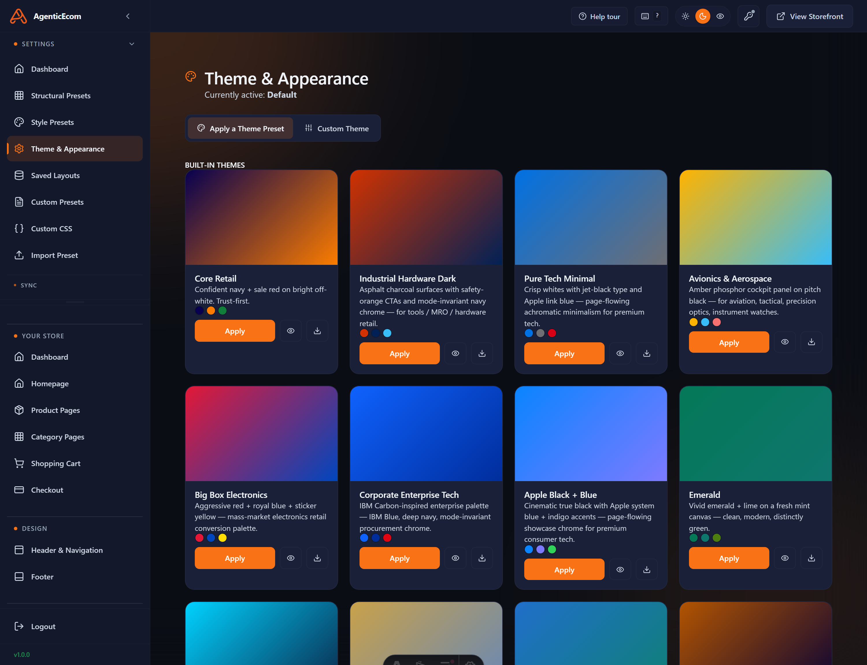
Section titled “Quick start — apply a ready-made theme”The fastest route. Apply a Theme Preset shows a gallery of hand-tuned, accessibility-checked themes — each with a live preview, a short description, its colour swatches and an Apply button.
-
Browse the gallery and find a theme that suits your brand (e.g. Core Retail, Industrial Hardware Dark, Pure Tech Minimal).
-
Click Apply on its card. The theme becomes live site-wide.
-
Prebuild so the change reaches the live store.
Build your own — the Custom Theme tab
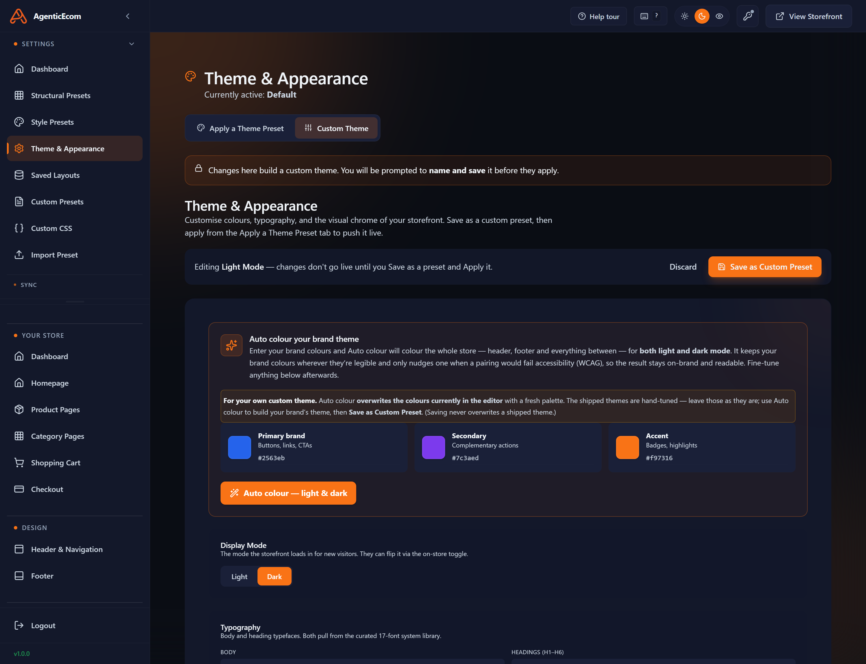
Section titled “Build your own — the Custom Theme tab”Switch to Custom Theme to colour the store from your brand colours. A banner reminds you: changes here build a custom theme — you’ll be prompted to name and save it before they apply, and “Editing Light Mode — changes don’t go live until you Save as a preset and Apply it.”
Auto colour (the one-click route)
Section titled “Auto colour (the one-click route)”The Auto colour your brand theme panel is the heart of it:
-
Enter your three brand colours — Primary, Secondary and Accent (each a hex field with a swatch).
-
Click Auto colour — light & dark. The system colours the whole storefront — header, footer and everything between — for both light and dark mode, keeping your brand colours wherever possible and only nudging a colour when a pairing would fail accessibility (WCAG) contrast. The chrome (header/footer) stays a fixed brand colour in both modes; only the page body flips light↔dark.
-
Fine-tune any individual colour afterwards if you want. Use the Display Mode (Light / Dark) toggle to check both.
Save it as a preset
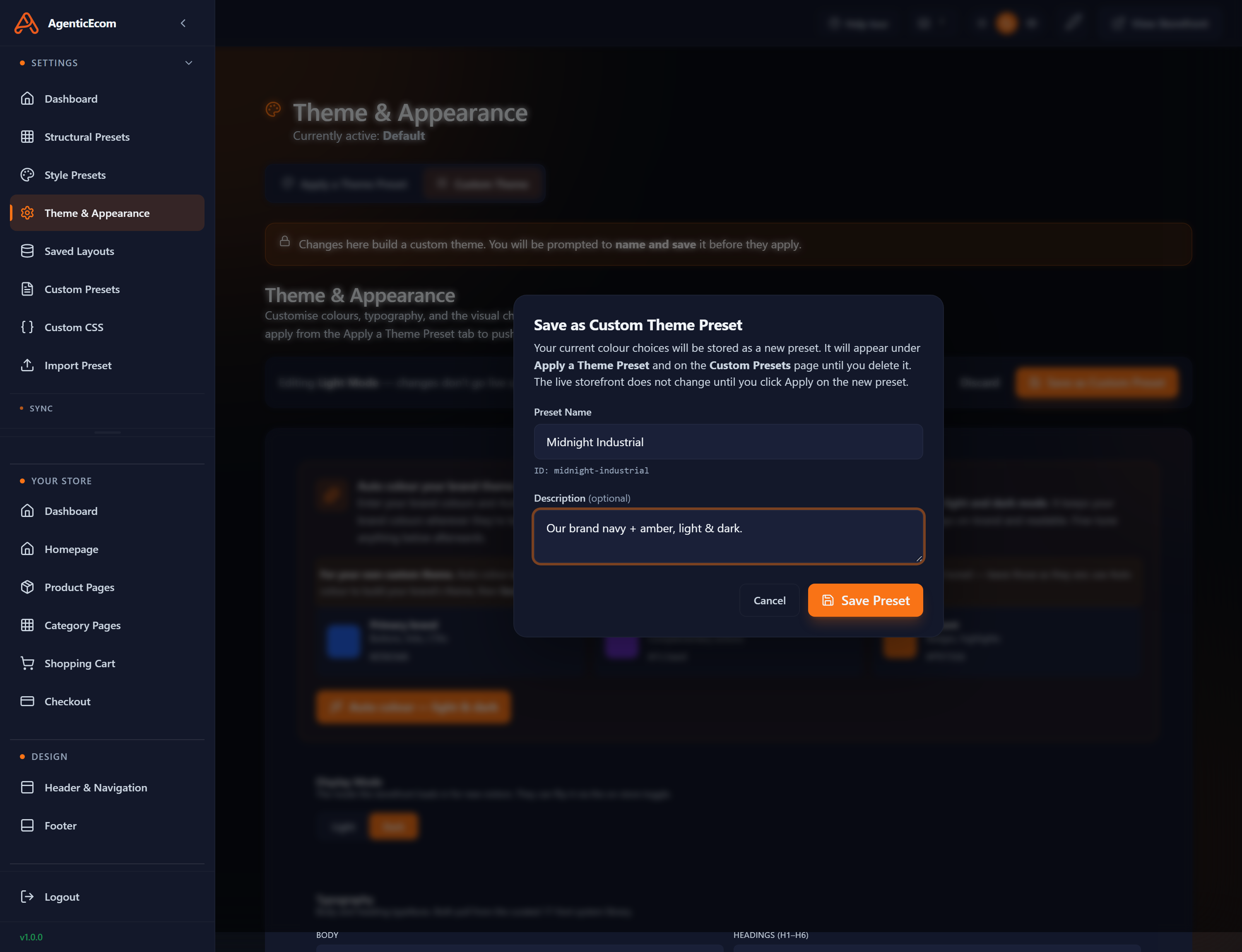
Section titled “Save it as a preset”When you’re happy, click Save as Custom Preset. You’re prompted for a name and an optional description — the theme is stored as a new preset and appears on both the Apply a Theme Preset tab and the Custom Presets page. It does not go live until you Apply it.
-
Save as Custom Preset → name it (e.g. “Midnight Industrial”) → Save Preset.
-
Go to Apply a Theme Preset (or Custom Presets), find your theme and Apply it.
-
Prebuild to push it live.
Accessibility & contrast
Section titled “Accessibility & contrast”Because foregrounds are derived from the real background colour, the theme system keeps text contrast readable by default. Still, after a big colour change, switch the live preview to both light and dark and check the hero and buttons — a very light Primary on a white Background can wash out, and the preview will show it before your customers do.