

Content
The block’s actual content — text, image, links, the SKU or category it points at.
The page editor (the Agentic Builder) is where you shape a page. You reach it from
Edit Design on any page tile in Structural Presets,
from Open Blank Editor, or by editing a Saved Layout.
Its URL looks like /admin/editor?type=homepage.
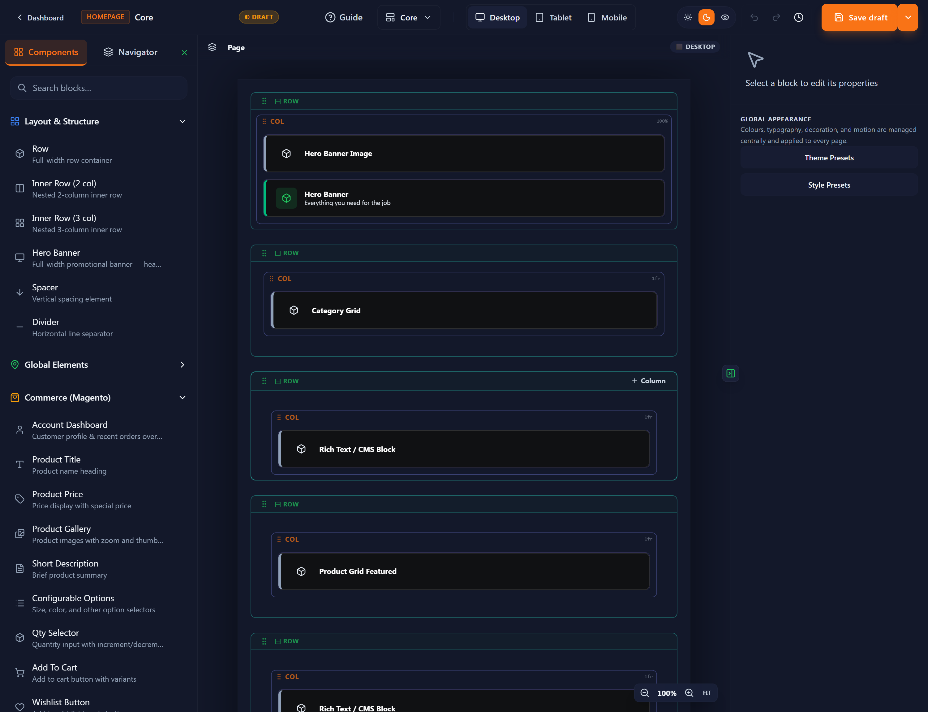
The palette is grouped:
Row (full-width container), Inner Row (2- or 3-column), Tabs, Accordion, Hero Banner, Spacer, Divider. Build your skeleton from these first.
Dynamic, data-bound blocks: Product Title, Product Price, Add to Cart, Category Grid, Account Dashboard, and more. These render real Magento data once the relevant sync has run.
Reusable pieces (e.g. a CMS block, rich text) that you can drop into any page.
Use the Navigator tab (next to Components) for a tree view of the whole page — handy on complex layouts for selecting a block that’s hard to click on the canvas.
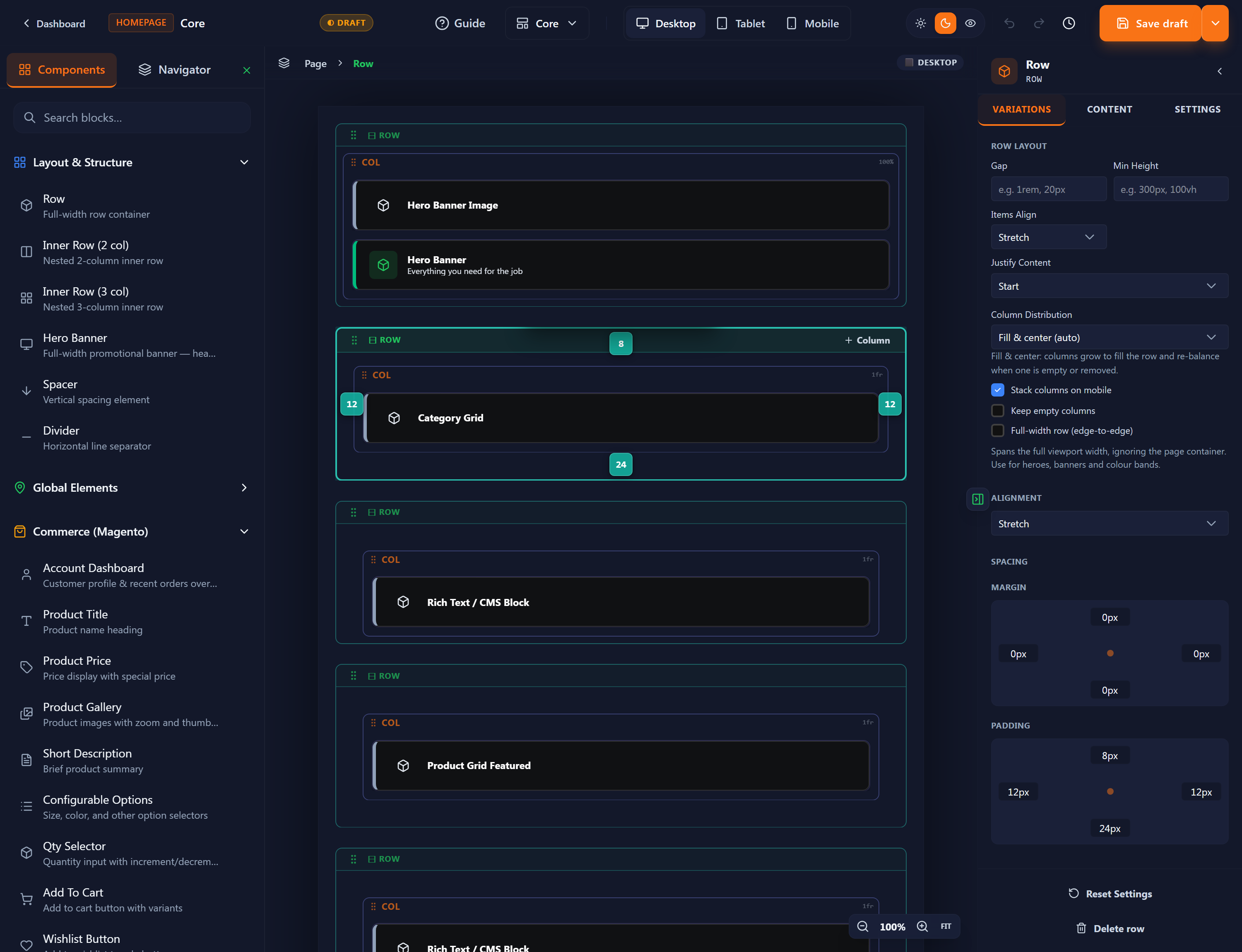
Select any block and the right panel shows its name and its tabs (Variations, Content, Settings), with Reset Settings and Delete at the bottom.
The Variations tab is a grid of ready-made layouts for that block — each a card with a name, a short description, and a mobile-behaviour tag (e.g. “Swipeable”, “2-col stack”). The active one has an accent ring and a ✓.
For example, the Category Grid ships variants like Scroll Rail (default), Masonry Grid, Featured + Grid, Circle Icons, Card Overlay, Image Cards, Tiles with Count and Carousel Scroll. The Hero Banner ships Fixed Cover, Parallax Scroll, Ken Burns Zoom and Diagonal Split.
Content
Settings / Advanced
Spacing
At the bottom of the panel: Reset Settings and Delete block.
The top bar has Desktop / Tablet / Mobile buttons. They resize the canvas so you can check each breakpoint; the current one is shown at the top-right of the canvas. Switch to Mobile before publishing to confirm your layout stacks sensibly — the variant tags (“2-col stack”, “Swipeable”) tell you how each block behaves on small screens.
The top bar has undo / redo and a history (clock) button. History keeps your saved drafts so you can restore an earlier version — see the Save menu below.
The Save button is a split button. Its dropdown is the heart of how the editor works — learn these four options:
A checkpoint, stored in History. It does not go live. Use this constantly while you work.
Name it — this saves the page as a custom preset. It does not go live on its own: you then activate it on Structural Presets for that page type, then Prebuild. (The on-screen note says exactly this: “Save as a custom preset. Activate it on Structural Presets to go live.”)
Keep a reusable copy without going live. This is how you create a custom structural preset.
Restore, publish or name a previously saved version.
Work on the page, saving drafts as you go. The canvas itself is the live preview — there is no separate Preview button.
When it’s right, choose Publish from the Save menu and give it a name. This stores it as a custom preset (it does not change the live store yet).
Activate that preset on Structural Presets for this page type.
Prebuild to push it to the live storefront.