

Core
Department-store premium baseline. A safe, clean default.
A Style preset is the storefront’s shape language — the site-wide decoration tokens: surfaces, corner radii, borders, shadows, motion and typography accents. It’s distinct from Structure (layout) and Theme (colour). One style preset applies to the whole store.
Open it at Style Presets in the sidebar (/admin/style-presets).
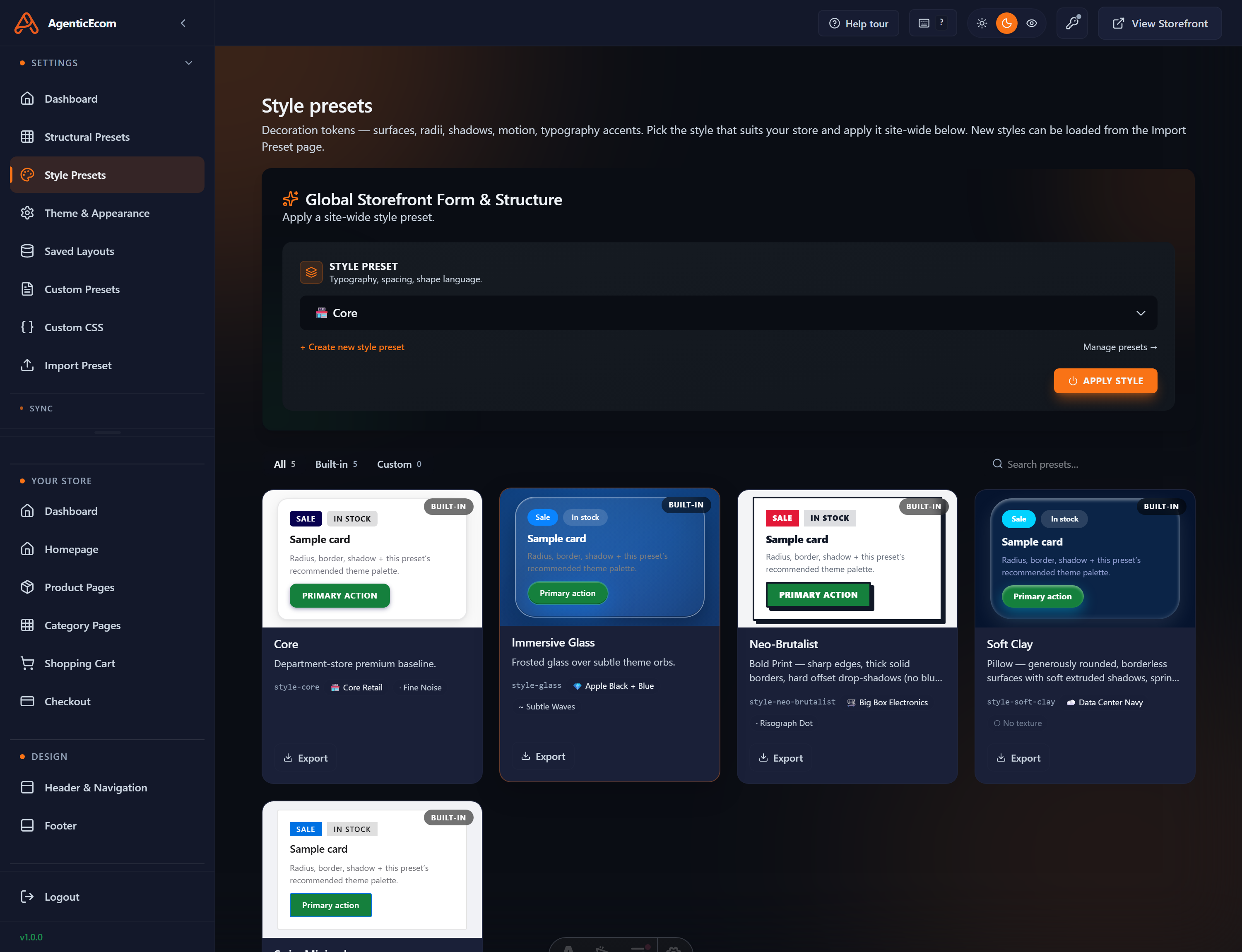
At the top, the Global Storefront Form & Structure panel shows the active style preset in a dropdown, with a ● Currently live marker.
Pick a preset and click Apply Style.
Prebuild so the new style reaches the live store.
The card grid (with All / Built-in / Custom tabs and search) shows each style with a live “Sample card” preview so you can see the radius, border, shadow and button look before applying. The built-ins include:
Core
Immersive Glass
Neo-Brutalist
Soft Clay
Each card also shows its id (e.g. style-core, style-glass), a recommended theme palette
and a texture (e.g. “Fine Noise”).
You don’t build a style from blank — you fork a built-in. Open the built-in style closest to what you want and click Edit. The style editor opens (/admin/style-presets/<id>). (You can also load a style someone exported via the Import Preset page.)
The left side has token groups you can expand:
Each token has a value editor and a { raw } toggle that reveals the underlying CSS (values can reference theme variables, so colour stays driven by your Theme).
The right side is a live preview — a mini storefront (header, hero, product cards) that re-renders as you change tokens. It has light/dark and Rest/Hover toggles and accent swatches, so you can check interaction states.
When you’re happy, click Save as…. In the Save as new style preset dialog, give it a name, description and icon, and pair it with a structural suite. (Built-ins are read-only, so Save as… is how you keep your changes.)
It’s easy to mix these up:
Style preset = shape
Theme = colour
A red, sharp-cornered store and a red, soft-cornered store share a theme (red) but use different styles (sharp vs soft). Change colour in Theme; change shape in Style.